If Your Name Dropped an Album, What Would the Cover Look Like?
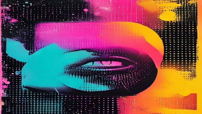
Every name is an album waiting on a release date. Yours has a genre, a cover concept, and a track three that would absolutely make someone cry in a parked car. The letters you were handed at birth have been in the studio this entire time, layering harmonies while you did your errands.
Type your first name below and the machinery will decode its sonic fingerprint into a full album concept: cover art, mood, and the general temperature of the tracklist. No refunds, no remixes. Your name already picked its era — you are simply arriving late to the listening party.
See every possible result for this quiz and what each one means →
Somebody had to invent the decorated sleeve
Records were once sold in plain paper. The illustrated album cover is generally credited to Alex Steinweiss, a young designer working for an American label around 1940, who argued that a picture on the front would sell more copies and was proved right emphatically enough that the rest of the industry copied the idea within a few years.
The twelve-inch long-player then handed designers a large square canvas and roughly two decades of ideal conditions. Jazz labels developed house styles built on cropped photography and confident type; British design partnerships turned sleeves into surreal photographic puzzles shot on location at considerable expense. The cover became a group's visual identity and the object you propped against the speaker while the record played, which is a kind of sustained attention no other packaging has ever received.
Then it shrank. The compact disc cut the canvas to a fraction of its former area and streaming reduced it again to a thumbnail on a phone. That constraint explains a great deal about current cover design: one face, one word, a flat field of colour, because whatever sits on the front must survive being reproduced at the size of a postage stamp. Vinyl's revival has brought large artwork back as a selling point for exactly the same reason.
Covers signal genre; names do not
A sleeve is a promise about sound made before anybody has heard a note. Grainy film photography and lowercase lettering suggest one thing; chrome, saturation and a heavy typeface suggest another; a nearly blank field with small serif type is a claim to being taken seriously. Art directors work from mood boards precisely because these codes are learned and shared, borrowed in turn from old soul reissues, club flyers, catalogue photography and, increasingly, from other album covers.
What a name cannot do is carry any of that. Naming fashions run in cohorts, so a first name is a decent clue about roughly when somebody was born and almost nothing else: no sound, no palette, no era. The reveal here works by converting the letters you type into a number and choosing a result from it, which is a magic trick with the mechanism printed on the box. Read yours as a design brief you are perfectly free to ignore.
How this one works: the name you type is turned into a number, and that number picks one of the results below. It is a party trick rather than a reading — the fun is in which one you land on, not in it being true.